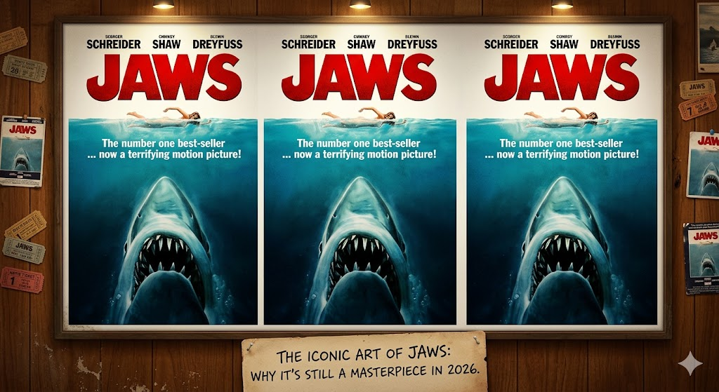
Have you ever looked at a picture and felt a little bit scared but also very excited? That is exactly what happens when people see the poster of jaws. This piece of art is one of the most famous movie posters in history. It shows a huge shark swimming up toward a person on the surface. Even if you have never watched the movie, you likely know this image. It was created to grab your attention and tell a story without using any words. For decades, this image has made people think twice before jumping into the ocean.
I remember seeing this poster for the first time on a vintage wall. The scale of the shark compared to the swimmer is what makes it so powerful. It uses a simple design to create a lot of emotion. In this guide, we will look at how this artwork was made and why it still works so well today. We will explore the artist behind the brush and the small details that make it a masterpiece of cinema history.
Fast Facts About the Jaws Movie Art
| Feature | Details |
| Main Artist | Roger Kastel |
| Year Released | 1975 |
| Primary Colors | Blue, White, and Red |
| Central Figure | Great White Shark (Chrissie Watkins above) |
| Art Style | Realistic Oil Painting |
| Impact | Defined the “Blockbuster” Summer Movie |
Who Created the Famous Poster of Jaws?
The man who painted the poster of jaws is named Roger Kastel. He was a very talented artist who worked on many book covers and movie ads. When he was asked to make this, he didn’t just snap a photo. He actually painted it using oil paints on a board. This gives the image a deep and rich feeling that looks much better than a simple computer-made graphic. Kastel wanted the shark to look massive and terrifying.
He spent a lot of time making sure the teeth looked sharp and the water looked real. Interestingly, he used a real person as a model for the swimmer at the top. He also visited museums to study how sharks look when they are hunting. His hard work paid off because his painting became the face of the film. Even though the movie used a mechanical shark that often broke, the shark on the poster always looked perfect and scary.
The Story Behind the Giant Shark Image
The poster of jaws actually started as a book cover. Before the movie came out, Peter Benchley wrote the novel. The publishers wanted a cover that would make people want to buy the book at the airport or grocery store. The first versions were okay, but they weren’t quite right. When the movie started filming, the studio decided they needed something even bolder to sell tickets.
They took the idea from the book cover and made it bigger. They made the shark look much larger than a real great white shark would ever be. This was a smart move. It told the audience that this was not just a nature documentary. It was a thriller about a “monster” from the deep. This “underwater perspective” is now a classic trick used by many other artists to create a sense of danger in their work.
Why the Design Is So Scary
If you look closely at the poster of jaws, you will notice a few things. First, the shark is coming from the bottom of the frame. This represents the “unknown.” We cannot see what is below the shark, which makes us feel uneasy. Second, the swimmer is at the very top in the light. She has no idea what is coming for her. This creates a feeling of suspense that makes your heart beat a little faster.
The sharp, jagged teeth are the focal point. They are bright white against the dark blue water. This contrast draws your eye straight to the danger. The red “JAWS” text at the top is also very important. Red is the color of warning and blood. When you put all these pieces together, you get a recipe for a perfect scare. It is a visual lesson in how to build tension using only a few shapes and colors.
The Colors Used in the Artwork
The color palette for the poster of jaws is very simple but effective. It uses mostly blues, whites, and that bold red title. The blue represents the deep, cold ocean where secrets are hidden. As the water gets deeper in the painting, the blue gets darker. This makes the shark look like it is emerging from a dark abyss. It adds a layer of mystery to the whole image.
The white of the shark’s belly and the foam on the waves makes the image pop. Without these highlights, the poster might look too muddy or dark. Then, you have the red font. Red is a “hot” color, while blue is a “cool” color. Putting them together makes the title stand out so you can read it from far away. It is a classic example of how color theory is used in marketing to make things memorable.
The Impact on Pop Culture
The poster of jaws did more than just sell movie tickets. It changed the way we look at the ocean. Before 1975, many people didn’t think much about sharks. After this image became famous, “shark fever” took over the world. People started buying t-shirts, towels, and toys with this exact image on them. It became a symbol of the summer season and the “blockbuster” movie era.
Today, you can find parodies of this poster everywhere. Other movies, cartoons, and even politicians have copied the layout. They replace the shark with something else to make a joke or a point. When an image is copied that many times, you know it is a true icon. It has stayed relevant for over fifty years, which is very rare for any piece of advertising. It proves that great art can live forever.
How the Poster Helped the Movie Succeed
When Jaws was getting ready to hit theaters, people weren’t sure if it would be a hit. The director, Steven Spielberg, was still very young. However, the poster of jaws acted like a giant billboard that everyone talked about. It created “word of mouth” before the movie even started playing. People saw the art and told their friends, “We have to see the movie with the giant shark!”
It simplified the story into one single image. You didn’t need to read a long summary to know what the movie was about. It was about a big shark and the people it hunted. This simplicity helped the film become the highest-grossing movie of its time. The marketing team realized that a strong visual is often more powerful than a trailer. They used the art on everything, creating a brand that people still recognize today.
Collecting Vintage Jaws Posters
If you are a fan of movies, you might want to own an original poster of jaws. These are very popular with collectors. An original poster from 1975 can be worth a lot of money, especially if it is in good condition. People love them because they represent a special time in Hollywood history. They look great in a home theater or an office.
When looking for a real one, you have to check the size and the paper quality. Many reprints exist, but the originals have a specific feel. Some collectors even look for the “International” versions which might have different text or layouts. Owning one is like owning a piece of the beach. It brings back memories of the first time you heard that famous “dun-dun, dun-dun” music. It is a classic piece of Americana that never goes out of style.
Why Minimalism Works in Movie Art
The poster of jaws is a great example of minimalism. Even though the shark is detailed, the overall layout is very clean. There is a lot of “dead space” or empty water. This is a design choice. It makes the subjects—the shark and the swimmer—stand out much more. If the artist had added boats, birds, and palm trees, the image would be too crowded.
By keeping it simple, the artist forces you to focus on the conflict. It is “Nature vs. Human.” This is a theme that everyone understands, no matter what language they speak. That is why the poster worked so well in other countries too. You don’t need to read English to understand the danger shown in the painting. Simple designs are often the ones that stick in our brains the longest.
Real-Life Inspiration for the Art
Did you know that the shark on the poster of jaws was based on a real shark? Roger Kastel visited the American Museum of Natural History to see a taxidermy great white shark. He wanted to see how the mouth looked when it was open wide. He took photos and made sketches to make his painting look as realistic as possible. This attention to detail is why the shark looks so “alive.”
The girl at the top was also modeled after a real person. Kastel had a model lie on a stool to mimic the swimming motion. He wanted to capture the way the water splashes around a person. These real-life touches make the fantasy of the movie feel like it could actually happen. It grounds the “monster” story in reality. When things feel real, they are much scarier to the audience.
The Legacy of Roger Kastel
While the movie made Steven Spielberg a star, it also made Roger Kastel a legend among artists. He went on to paint the poster for The Empire Strikes Back, which is another famous movie. But the poster of jaws remains his most famous work. He showed the world that a movie poster could be a beautiful oil painting instead of just a photo of the actors.
Kastel passed away recently, but his art lives on. Every time a new “shark week” starts or a new ocean thriller is made, people talk about his work. He set the standard for what a thriller poster should look like. Artists today still study his use of light and shadow. He proved that an illustrator is just as important to a movie’s success as the actors on the screen.
Conclusion
The poster of jaws is more than just an advertisement for a 1970s film. It is a masterpiece of design that taps into our deepest fears. Through the clever use of scale, color, and suspense, Roger Kastel created an image that will likely be famous for another fifty years. It taught us that what we don’t see under the water can be just as scary as what we do see.
Whether you are a movie buff, an art lover, or someone who just loves a good scare, this poster has something for you. It reminds us of the power of a single image to change culture. So, the next time you see that giant shark rising from the depths, take a moment to appreciate the skill it took to create it. And maybe, just maybe, stay out of the water for a little while!
Frequently Asked Questions
1. Is the shark on the poster real?
No, the shark on the poster of jaws is a painting. Artist Roger Kastel used oil paints to create the image. He studied real sharks in museums to make it look as lifelike as possible, but it is a work of art, not a photograph.
2. Who is the swimmer on the poster of jaws?
The model for the swimmer was a woman named Allison Maher. She was a model who worked with Roger Kastel. In the movie, the character is Chrissie Watkins, who is the first person the shark encounters.
3. Why is the shark so much bigger than the swimmer?
The artist made the shark much larger for dramatic effect. In real life, a great white shark is big, but not that much bigger than a human. Making it giant on the poster of jaws helped show how dangerous and powerful the creature was.
4. Can I buy an original poster?
Yes, but original 1975 posters are quite expensive. You can find many high-quality reprints at movie shops or online. If you want a real “theatrical” version, you should look at reputable auction sites for movie memorabilia.
5. What happened to the original painting?
The original oil painting by Roger Kastel actually went missing many years ago. After it was used to make the posters, it was sent to different places for displays and was never returned to the artist. It is considered a “lost” treasure of Hollywood.
6. Did the poster change how people feel about sharks?
Yes, very much so. The poster of jaws and the movie itself created a lot of fear toward sharks. Scientists today work hard to show that sharks are not actually “monsters,” but the image of the giant shark is still very strong in people’s minds.